It is common for logos to include the brand's name. However, we also see many major brands that shape their industries using only their own symbol, without any name. Apple, Nike, and Target are examples of category leaders in their respective fields that rely solely on their own logo.
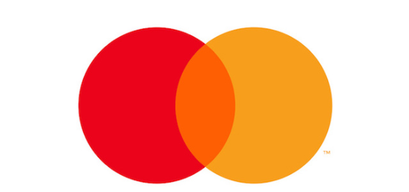
A few months ago, Mastercard announced that it had removed the word ‘Mastercard’ from its logo. Mastercard executives stated that they conducted a worldwide consumer study lasting more than 20 months to determine whether customers would recognize the brand from the symbol alone. They reported that after finding that more than 80 percent of people recognized the Mastercard logo even without the word ‘Mastercard’ written on it, they decided to remove the name from the brand mark.
The effort to remove the name ‘Mastercard’ from the logo actually began much earlier. In 2016, the company first moved the word ‘Mastercard’ out from inside the circles and placed it underneath them.
Later, when the word ‘Mastercard’ beneath the overlapping yellow and red circles was removed from the logo altogether, the interlocking circles that had become the Mastercard symbol were left standing alone in the brand's logo. Mastercard aims for its nameless logo to adapt more easily to new conditions and, as a result, to blend seamlessly into an increasingly digital world.
Michael Bierut, the graphic designer at Pentagram behind the logo design, said that today communication happens through icons and symbols much more than through words. Praising the yellow and red circles Mastercard has used since 1966, Bierut noted that by removing the name from its logo, Mastercard joined the ranks of elite brands that use only a symbol, with no name at all.
We hope to see similar moves from Turkish brands as well. I suppose we need to become a bit more global for this kind of step to make sense. Let's say it plainly: let's globalize more, and earn more space in people's minds.